Turn raw data into cleaned reports, KPI dashboards and AI-ready insights
Upload Excel and CSV files or connect your data, then ask in plain English or Hindi — by text or voice. DataPilots cleans the file, builds the dashboard, compares versions and hands you export-ready Excel, PDF and PowerPoint reports.
For MIS reporting, business analytics and AI-assisted data exploration.
Secure uploads
Files are tied to your account and readable only by you and the members you invite.
Export-ready outputs
Excel workbooks, formatted PDF reports and high-resolution chart images.
Business-friendly dashboards
KPI cards, charts and pivot matrices built for reporting, not for coders.
Optional BYOK
Advanced users can connect their own AI provider key. Entirely optional.
Works with the data you already have
What goes in, what comes out
One path from the file on your desktop to the report in your review meeting.
- Excel workbooks (.xlsx, .xls)
- CSV exports
- Google Sheets
- Connected business data
- Analytics datasets
- Clean and structure
- Compare files and versions
- Calculate and aggregate
- Summarise and explain
- Visualise and answer questions
- Cleaned data files
- KPI dashboards
- Charts and pivot matrices
- Comparisons and variance
- Excel, PDF and PowerPoint reports
This is what you get
A real dashboard generated from an uploaded sales file — dataset-driven KPIs, visuals and a drill-down table, ready to filter and export.
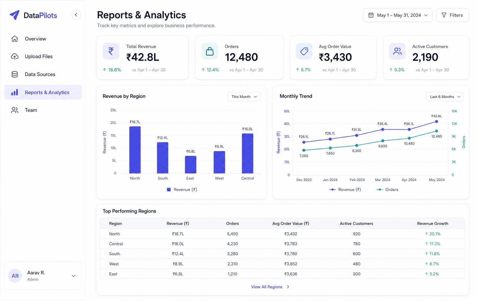
Auto-generated KPIs
Totals, averages and top/bottom contributors picked from your columns.
Charts you control
Bar, line, area and pie — per-series colours, filters and click-through drill-downs.
Pivot matrices
Excel-style rows, columns and values with drag-and-drop fields.
PDF, Excel & PowerPoint export
Share a formatted report, hand over the workbook, or present a ready-made slide deck.
Built for the people who publish the numbers
Reporting teams, analysts, operators and founders — technical or not.
MIS Reporting
Convert recurring raw Excel files into clean, dashboard-ready reports every cycle.
Business Analytics
Ask questions, compare trends and generate KPI dashboards without building them by hand.
Operations Reporting
Track throughput, exceptions and branch-level performance from the exports you already receive.
Finance & KPI Review
Reconcile month-on-month files, calculate variance and publish a review-ready pack.
Agency & Client Reporting
Turn client data into branded PDF, Excel and PowerPoint deliverables in a single session.
Data Exploration
Prompt in English or Hindi to summarise datasets, test hypotheses and surface patterns fast.
Five things DataPilots does for every dataset
From a messy source file to a report your team can act on.
Clean messy data
- Remove blank rows, logo bands and stray headers
- Normalise headers, dates, numbers and text
- Prepare analysis-ready tables — original file untouched
Build dashboards fast
- KPI cards with trend sparklines
- Bar, line, area, combo and pie charts
- Pivot matrices and filterable summary tables
Ask AI about your data
- English or Hindi prompts
- Text or voice input
- Guided insights with the numbers cited
Compare and analyse
- Compare files month-on-month or source vs source
- Calculate differences, variance and % change
- Surface trends, seasonality and exceptions
Export ready-to-share outputs
- Excel workbooks with data and charts embedded
- Formatted PDF reports with insights
- Cleaned datasets and PNG/JPG chart assets

Spreadsheet cleanup & structuring
Header normalisation, removal of logo and title rows, empty row and column stripping, type and date standardisation — on files that were never built for reporting.

AI transformation & multi-file comparison
Describe the change in plain language — recalculate a column, group by branch, compare this month's file against last month's. The agent applies it and explains what it did.

KPI dashboards & export-ready reports
KPI cards, charts, pivot matrices and written insights on one saved dashboard — reopen next month, drop in the new file, export to Excel, PDF or PowerPoint.
One messy file, four steps, a finished report
This is the exact sequence you get on your own data — nothing staged.
Upload raw file
A monthly Excel export with a logo band, merged titles and the real header sitting on row 6.
AI cleans and structures
Header row detected, blank rows and columns dropped, dates and numbers standardised, duplicates flagged.
Dashboard and KPIs generated
Relevant KPIs and visuals are selected from the actual dataset, with drill-down tables and a written summary.
Export and share
Download the cleaned dataset, an Excel workbook or a formatted PDF report for your review meeting.
Before — raw upload
- Logo band and merged title rows above the data
- Real header sitting on row 6
- Blank rows, blank columns and duplicate entries
- Dates stored as text, amounts stored as strings
After — decision-ready output
- Cleaned, typed table you can download
- Relevant KPIs with trend sparklines
- Charts, drill-down tables and a pivot matrix
- Written insight summary with the numbers cited
- Excel workbook and formatted PDF report
Ask in the language your team already uses
Request dashboards, summaries, comparisons or calculations in English, Hindi or a mix of both — typed or spoken. The analysis, tool steps and chart output are identical in every language; only the wording of the answer changes.
- Plain English or Hindi — including Hinglish prompts
- Voice commands on supported browsers, in both languages
- Business wording, not query syntax — no formulas required
- Follow-up questions keep the context of your dataset
“Compare March and April sales by region and show the biggest drops.”
Built a region comparison chart. North fell 12.4% month-on-month — the largest decline of six regions.
“पिछले छह महीने का रेवेन्यू ट्रेंड चार्ट बनाओ और अगले महीने का अनुमान दो।”
छह महीने का ट्रेंड चार्ट तैयार है। अगले महीने का अनुमान ₹18.4 लाख (±6%) है।
“Top 10 customers ka KPI card banao aur PDF export ready karo.”
KPI card added for top 10 customers by revenue. PDF report is ready to download.
One AI agent that does the whole analyst job
The DataPilots AI Agent works on your actual data — cleaning it, calculating on it, explaining it and building the dashboard. The Interactive AI Assistant sits alongside it to answer questions and refine anything on screen.
Cleaning & structuring
Finds the real header row under logos and title bands, drops blank rows and columns, de-duplicates, and standardises dates, numbers and text — without touching your original file.
Multi-sheet & multi-file
Reads every sheet in a workbook, lets you choose which to analyse, and compares several files side by side — this month against last, source against source.
Complex calculations
Custom formulas and calculated columns, running totals, moving averages, ratios, variance and percentage change computed across the full dataset, not a sample.
Trends & forecasting
Detects direction, seasonality and outliers, then projects forward — rendered as trend lines, combo charts and multi-series comparisons on your dashboard.
Insights & suggestions
Plain-language summaries of what changed and why, with recommended next checks and the KPIs worth watching for your dataset.
Prompt-built dashboards
Ask in normal language and the agent creates or edits KPIs, charts, tables and pivot matrices — and hands back the cleaned, transformed file to download.
Your data stays yours
No lock-in, no black box, no formulas or code required to get value.
Account-scoped access
Datasets are readable only by you and the members you invite, enforced by row-level rules in the database.
Secure uploads
All traffic runs over HTTPS, and subscription payments are processed securely by Cashfree.
Exportable outputs
Take cleaned data, workbooks, PDF reports and chart images with you at any time.
Optional BYOK
Connect your own OpenAI, Anthropic or Gemini key if you prefer AI usage billed by your provider.
Delete controls
Remove files, dashboards and connections whenever you want — deletion is yours to trigger.
Team visibility
Seats, roles and an activity log so an owner can see who did what.
Frequently asked questions
What analytics, operations and reporting teams usually ask before subscribing.
Still have a question? Talk to our team
From raw files to decision-ready outputs in minutes
Start on the 14-day trial, upload a spreadsheet, and get a cleaned dataset, KPIs, charts and an export-ready report in the same session. Basic ₹1,999/month, Pro ₹3,499/month.
Built for MIS teams, analysts, operators and data-driven businesses.